
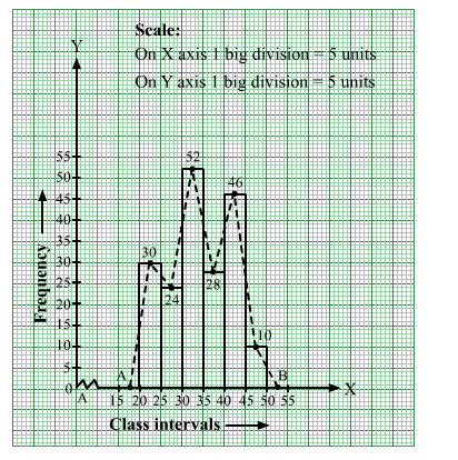
Draw a histogram and the frequency polygon from the following data.

We represent the class intervals along the x-axis and the corresponding frequencies along the y-axis.
We construct rectangles with class intervals as bases and respective frequencies as heights.
We have the scale as follows:
On the x-axis, 1 big division = 5 units.
On the y-axis, 1 big division = 5 units.
Because the scale on the x-axis starts at 15, a kink, i.e., a break, is indicated near the origin to signify that the graph is drawn with a scale beginning at 15
and not at the origin.
Thus, we obtain the histogram, as shown below.
We join the midpoints of the tops of adjacent rectangles by line segments.
Also, we take the imagined classes 15–20 and 50–55, each with frequency 0. The class marks of these classes are 17.5 and 52.5, respectively.
So, we plot the points A( 17.5, 0) and B(52.5, 0). We join A with the midpoint of the top of the first rectangle and B with the midpoint of the top of the last rectangle.
Thus, we obtain a complete frequency polygon, as shown below:
Click here to get exam-ready with eSaral
For making your preparation journey smoother of JEE, NEET and Class 8 to 10, grab our app now.