
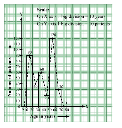
The ages (in years) of 360 patients treated in a hospital on a particular day are given below.

Draw a histogram and a frequency polygon on the same graph to represent the above data.
We represent the class intervals along the x-axis and the corresponding frequencies along the y-axis.
We construct rectangles with class intervals as bases and respective frequencies as heights.
We have the scale as follows:
On the x-axis:
1 big division = 10 years
On the y-axis:
1 big division = 2 patients
Thus, we obtain the histogram, as shown below.
We join the midpoints of the tops of adjacent rectangles by line segments.
Also, we take the imagined classes 0–10 and 70–80, each with frequency 0. The class marks of these classes are 5 and 75, respectively.
So, we plot the points A(5, 0) and B(75, 0). We join A with the midpoint of the top of the first rectangle and B with the midpoint of the top of the last rectangle.
Thus, we obtain a complete frequency polygon, as shown below:
Click here to get exam-ready with eSaral
For making your preparation journey smoother of JEE, NEET and Class 8 to 10, grab our app now.