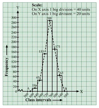
Draw a histogram for the following data.

Using this histogram, draw the frequency polygon on the same graph.
We represent the class intervals along the x-axis and the corresponding frequencies along the y-axis.
We construct rectangles with class intervals as bases and respective frequencies as heights.
We have the scale as follows:
On the x-axis:
1 big division = 40 units
On the y-axis:
1 big division = 20 units
Thus, we obtain the histogram, as shown below:
We join the midpoints of the tops of adjacent rectangles by line segments.
Also, we take the imagined classes 560–600 and 840–880, each with frequency 0.
The class marks of these classes are 580 and 860, respectively.
Because the scale on the x-axis starts at 560, a kink; i.e., a break, is indicated near the origin to signify that the graph is drawn with a scale beginning at 560
and not at the origin.
So, we plot the points A( 580, 0) and B(860, 0). We join A with the midpoint of the top of the first rectangle and join B with the midpoint of the top of the last rectangle.
Thus, we obtain a complete frequency polygon, as shown below: