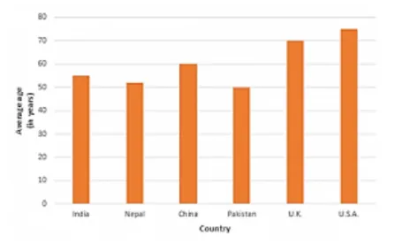
Question:
The following data shows the average age of men in various countries in a certain year.
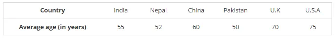
Represent the above information by a bar graph.
Solution:
To represent the given data by a vertical bar graph, we first draw horizontal and vertical axes.
Let us consider that the horizontal and vertical axes represent the countries and the average age of men’s respectively. We have to draw 6 bars of different lengths given in the table. At first, we mark 6 points in the horizontal axis at equal distances and erect rectangles of the same width at these points. The heights of the rectangles are proportional to the average age of men’s in different countries.
The vertical bar graph of the given data is following: